You might have noticed that we’re sporting a brand new look. Why the change? Well, our company has evolved and we wanted the Mobile Guardian brand identity to reflect this evolution. As a nod to our past we’ve left some elements unchanged, and updated others as a glance towards the future.
The next phase of our journey will see us launching new product offerings, as well as branching into new markets. No matter what we do, or where we go, we promise to keep our users top of mind. It’s important to us that our users have the a positive and consistent experience, wherever they interact with our brand. In light of this, we’ve developed our brand guidelines and defined how we look and sound across all our customer touch points.
Our logo & icon
The Mobile Guardian logo represents a shield. The shield symbolises our greater vision of ensuring that every device in the hand of every child, no matter where they are, is protected. Looking deeper, the three stripes represent our 3 product verticals: Home, School and Work.
![]()
Combined, the stripes work together to form a shield and this represents our commitment and promise to safeguard devices. There are two different versions of our icon available. The background colour, as well as the colour of the M are the only differences. Both our and icon logo are designed to be easily recognisable whether it appears online, in print or on an expo stand at a conference.
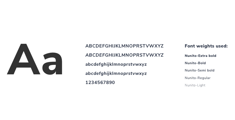
Our typography
Nunito Sans
Nunito is a well-balanced sans serif typeface superfamily, with 2 versions. We wanted our users to enjoy using our products and the right font is an important part of their experience. For our Dashboard UI we selected Nunito, as it is a more rounded font which is easy to read and great for all types of applications including print and online. With this in use we decided to go for a more bold typeface and Nunito Sans fitted perfectly. The selection of weights gave us ample room to experiment and adjust the typeface to suit our designs, whilst still remaining consistent.
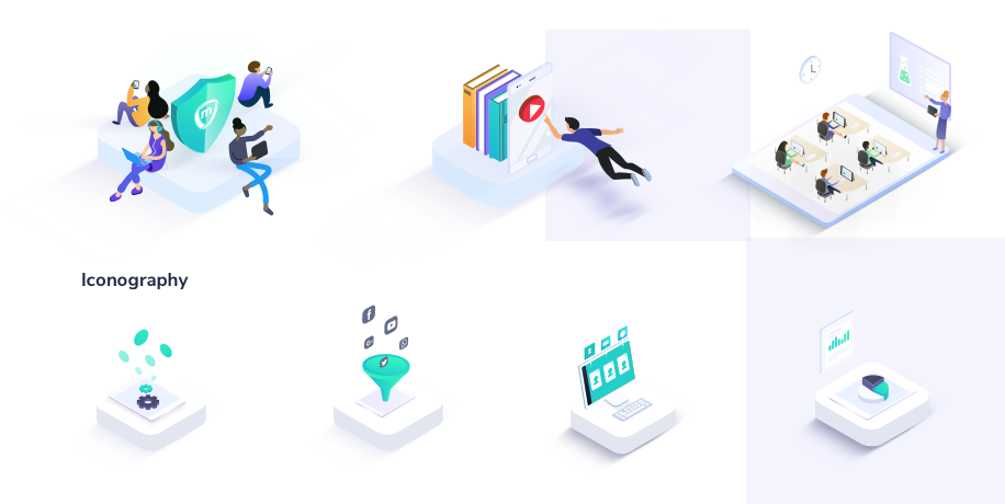
Illustrations
In the world of illustrations, there are many styles to choose from, many of which are still evolving and it took us several attempts to find the right one. Illustrations are an important tool in enhancing user experience of a product or service. Not only do they make the product design aesthetically pleasing but they help a user better understand product functionality and help guide behaviour. Isometric illustrations are a popular design choice and are the perfect fit for our illustrations and icons.
Our tone of voice
There is a lot of tech-related jargon in the mobile device management space and we’re striving to be the voice that cuts through it. Our goal is to make our communication as user-friendly and as digestible as possible. We’re friendly, down-to-earth and here to help you get the most out of our products.
Our approach
Our users are very important to us. It’s our mission to make products that are easy to use and add immense value to the people that work with them. As such, we spend a lot of time talking to, and getting input from our users. In 2018, we launched The Product Portal which enables users to submit and vote for features they’d like to see on our platform.
We hope you like our new style and are excited to celebrate this new stage of our journey with us.
Onwards,
Robyn Hobson
The Mobile Guardian Team